Fine Press Books and the King James Bible
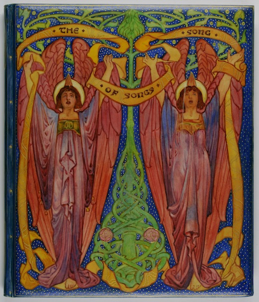
Song of Solomon. Chapman and Hall, 1897. Cary Collection, RIT.
The 40-location Manifold Greatness traveling exhibit is in the midst of its grand finale at the Nancy Guinn Memorial Library of the Rockdale-Conyers Library System in Conyers, Georgia; the Conyers exhibit runs through July 12, the final day of the 40-site tour. Several months from now, the recently retired panels will be on view in Rochester, New York, as explained by Manifold Greatness co-curator Steven Galbraith:
A few weeks ago one of the four sets of the traveling Manifold Greatness exhibition arrived at the Cary Graphic Arts Collection at the Rochester Institute of Technology, where they will be on display one last time this coming fall. Although that’s still several months away, I couldn’t resist putting up a few of the panels. It reminded me of my second post to the Manifold Greatness blog, The Exhibition Panels Have Arrived, back on April 15, 2011 (see photo below). I felt like I was being reacquainted with old friends, to whom I want to introduce new friends at RIT.
The focus of the RIT’s Cary Collection differs quite a lot from that of my previous home at the Folger Shakespeare Library. The Cary Collection documents the history of graphic communication, with an emphasis on the history of printing. One of the strongest collections here is of fine press books; that is, books that exhibit exceptional quality in design, materials, and execution. With this in mind, the Cary Collection’s version of Manifold Greatness will present the history of the King James Bible alongside 19th and 20th-century fine press editions of the Bible, most of which use the King James translation as their text.

Bible, Doves Press. 1903-05. Cary Collection, RIT.
For example, the edition of the King James Bible printed by The Doves Press is a typographical masterpiece (Hammersmith, England, 1903-1905). Designed to reflect 15th-century Venetian printing, this Bible has little ornamentation, letting the text speak for itself through an elegant typeface. The type’s designer and founder of the Doves Press, T.J. Cobden-Sanderson, is as famous for his type design as he is for what he eventually did with his type. In 1916 he threw his type and the punches and matrices used to make it into the River Thames. A dramatic end to the Doves Press.
The edition of The Song of Solomon published by Chapman and Hall in 1897 features beautiful Pre-Raphaelite-inspired plates designed by H. Granville Fell, but what makes the Cary Collection copy so outstanding is the book’s vellucent binding by Cedric Chivers (1853-1929) from Bath, England. In preparing a vellucent binding, a painting on paper is set beneath a translucent layer of vellum, so that the image can be seen through it. Any tooling, like the good tooling used in this design, was applied to the outside of the binding. Not only does this technique create a striking binding, but it also ensures that the painting won’t be damaged when the book is handled or shelved between other books.

April 15, 2011: The day the panels arrived! Folger exhibition team. L to R, curator Hannibal Hamlin, exhibitions manager Caryn Lazzuri, curator Steve Galbraith
One last example from the Cary Collection demonstrates that illustrations found in fine press editions of the King James Bible can be as remarkable as the type and the bindings. One of the most famous printmakers and type designers of the early twentieth century is Eric Gill (1882–1940). If you have used the typeface Gill Sans, then you are familiar with Gill’s work. Gill created 50 illustrations for The Golden Cockerel Press edition of The Four Gospels (1931). Look through these pages to see the Deposition of Christ as told in the Gospel of Mark, and notice how Gill incorporates the word “And” into the design. Joseph of Arimathea actually stands on the letter N, while a figure, perhaps Mary, the mother of Jesus, climbs a ladder that scales the side of the letter A. Mary Magdalene holds Jesus at the base of the cross.
These are just a few of the fine press editions of the King James Bible that will be on display at the Cary Collection this coming fall when we commemorate the 400th anniversary of the printing of the King James Bible. I guess it will officially be the 402nd anniversary, but who’s counting?
Steven Galbraith, Curator of the Cary Graphic Arts Collection at Rochester Institute of Technology, was co-curator of the Manifold Greatness exhibition at the Folger Shakespeare Library.